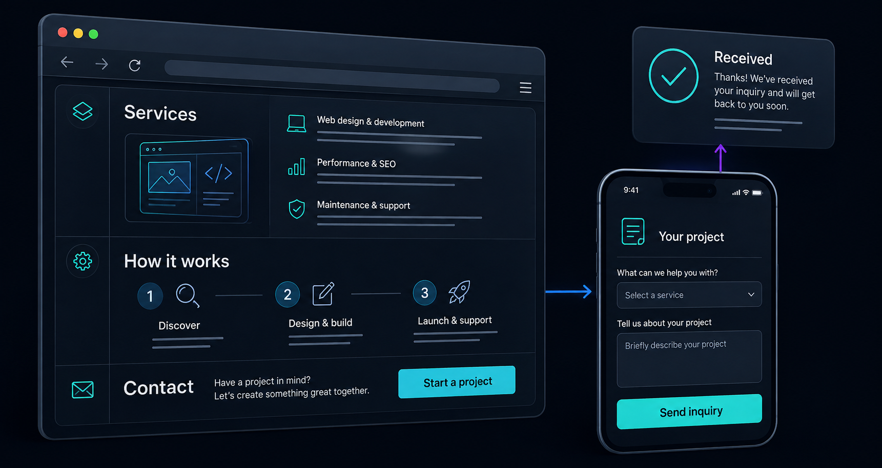
A potential customer lands on your website with a job to do. They may be comparing providers, checking a recommendation, or trying to work out whether you can help with a particular problem.
Before they write a message, they need enough information to decide whether a conversation is worth having.
We would start a website review with five questions. Open your site on your phone and try answering them from the perspective of someone who has never heard of your business.
1. What can you help me with?
A headline can have personality, but the copy around it should make your offer concrete. Name the work you do, the people or businesses it is for, and the problem it helps them address.
Imagine an installation business whose opening says, “Solutions for tomorrow.” A visitor still has to discover whether it handles residential work, commercial fit-outs, repairs, or something else entirely.
“Office furniture installation for businesses moving into a new space” gives that visitor a much clearer starting point. This is an illustrative example; the right wording depends on the business.
Try reading only your headline and the sentence beneath it. Would someone outside your industry understand what they can ask you to do?
2. Is this right for my situation?
Once a visitor understands the offer, help them recognise where they fit. A useful service page explains common starting points, the scope of the work, and any important boundaries.
For a website project, those starting points might include launching a new business, replacing a site that no longer reflects the company, or making an existing enquiry process easier to use.
Concrete examples help here. Show a typical problem and explain what you would consider when solving it. If the example is a concept rather than completed client work, say so clearly.
You can also explain what needs a conversation before you can give an answer. A custom project may need an initial discussion before you can estimate its cost or timing. Tell the visitor what information will help you scope it.
3. What can I use to judge your work?
Give visitors something they can examine: a relevant project, a working demonstration, a clear explanation of your process, or an article that shows how you approach a problem.
If you have permission to share a client project, explain what you actually contributed. If you are building your public portfolio, a clearly labelled concept can demonstrate design and implementation choices without implying a client relationship.
Be specific about decisions. Why did you simplify a form? What did you prioritise for someone using a phone? How would you decide whether an existing tool is enough?
Useful detail gives the visitor a basis for forming their own view. Keep claims about outcomes tied to evidence you can show.
4. What should I do next?
Choose a primary next step that fits the service: make an enquiry, request an estimate, book a conversation, or purchase an item. Use wording that tells the visitor what the action does.
Then walk the route yourself. Can you find the action from a service page? Does it work on your phone? Can you complete the form using a keyboard? Does a mistake lead to an explanation you can act on?
For the form itself, ask for what you need to begin. W3C’s accessible forms guidance recommends keeping forms focused, clearly labelling controls, and providing useful instructions and feedback when something goes wrong. Those are practical checks for an enquiry journey. W3C Forms Tutorial
A longer discovery conversation can follow once both sides know there is a potential fit.
5. What happens after I get in touch?
A successful submission needs a clear receipt. Tell the visitor that their message arrived and explain the next step in language that matches how you actually work.
That might mean reviewing the enquiry, asking a few follow-up questions, and arranging a conversation. Only state a response time if you can consistently meet it.
Check the business side too. Submit a test enquiry and verify that it reaches the right place, contains the information you need, and has an owner. A convincing confirmation on the website is only one part of a working enquiry process.
Try one complete visitor journey
Choose one service and follow it from the opening page through to a test enquiry. Write down where you hesitate, which questions remain unanswered, and whether the next step feels clear.
Ask someone unfamiliar with your business to do the same. Let them explain what they understand before you fill in the gaps.
You may find that a clearer service description, a better example, or a simpler form is the most useful first change. At Code + Carbon, those are the kinds of decisions we would explore before deciding how much of a website needs to change.
Bring us the page or journey that feels unclear, and we can talk through a useful starting point.
Put the idea to work
What’s getting in your way?
Bring us a workflow, a question, or an idea. We’ll help you find a useful place to start.